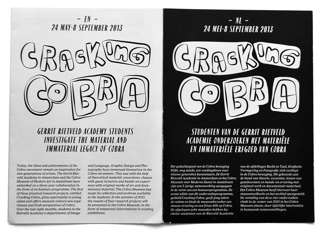
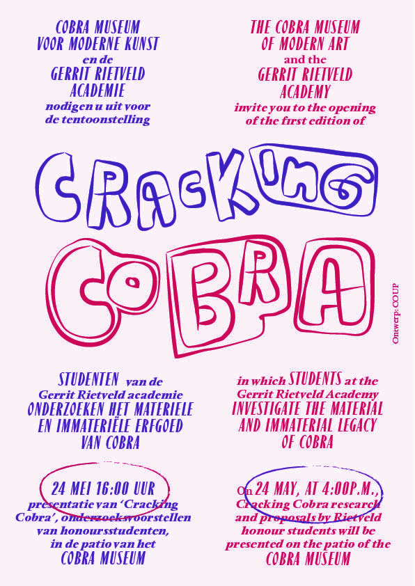
If you dive into the archives of the Cobra Museum — like the Rietveld students did in search of Cobra’s legacy — you may find the inspiration of the Cracking Cobra logo: a publication with the name Blurb on the cover that is drawn by Corneille.
Despite their difference in size the last letters of the name (urb) is grouped. It reminded COUP of the fact that the name Cobra was originally written as CoBrA (an abbreviation of Copenhagen, Brussels and Amsterdam).
Design concept: The Blurb publication gives an idea of how Corneille would have designed the word Cobra or Cracking Cobra if someone would have asked him around 1951. Since this project deals with the legacy of Cobra, COUP decided to use this clue on a flyer (printed in two colors) and on bilingual handouts (in black). The other typefaces (Paris and Stanley Reader) originate from another project at the Cobra Museum where Cracking Cobra was part of: Cobra en Plein Air.