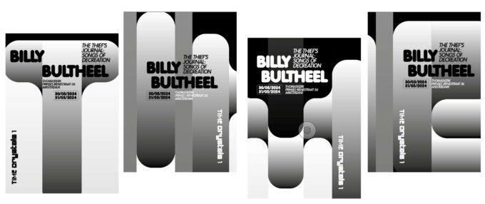
Time Crystals is an Amsterdam-based program initiated and organized with curator Suzanne Wallinga. Together with a diverse range of collaborators including artists, musicians, scholars of performance art, sound artists, filmmakers, writers, and other creatives, we are crafting a dynamic live program that delves into the essence of performance art and its significance within the Amsterdam
CategoryFlyer
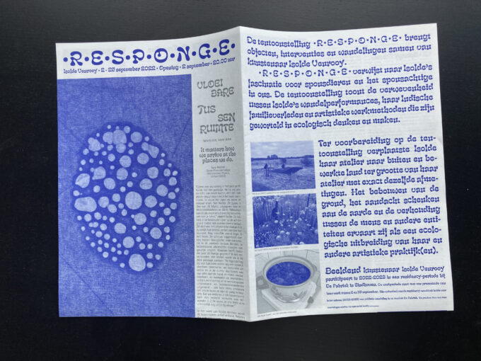
•R•E•S•P•O•N•G•E• (2022) Exhibition handout for Isolde Venrooy
A handout designed for the Isolde Venrooy solo-exhibition •R•E•S•P•O•N•G•E• in De Fabriek in Eindhoven. The text takes unexpected detours following the line of ‘between’ in order to queer directions, a connecting theme in Isolde’s work.
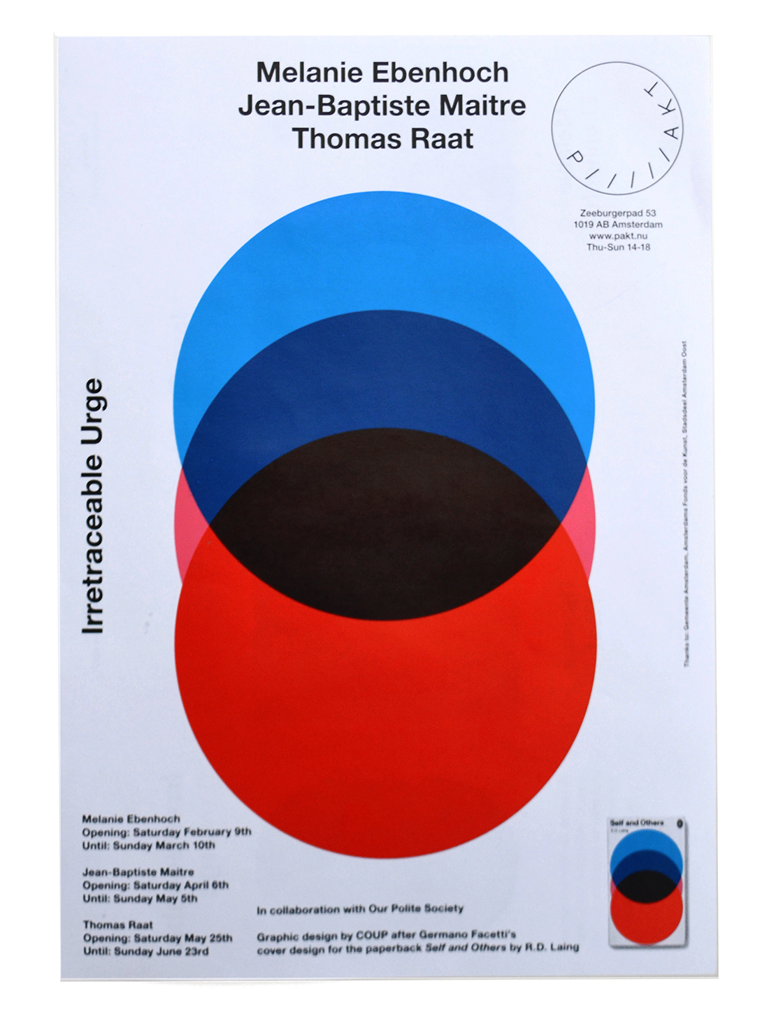
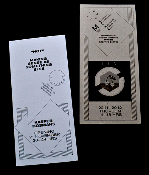
— > Flyer / poster for PAKT: The Irretraceable Urge.
In this exhibition three artists referred to applied visual language from the past. One of them, Thomas Raat, is known for copying visuals from penguin paperback covers.
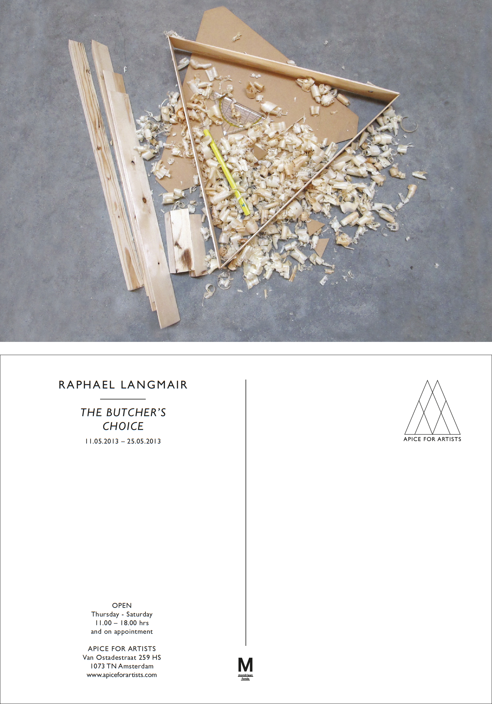
— > Logo design and series of postcard flyers for Apice for Artists.
Apice for Artists produces art projects and stimulates dialogue in presenting artistic practices. Apice is Daniela Apice.
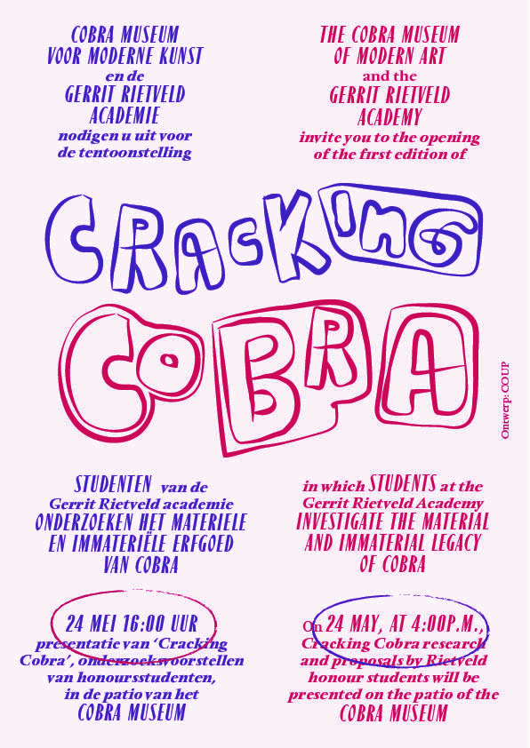
— > Flyers / brochures for Rietveld Academy workshops in the Cobra Museum.
If you dive into the archives of the Cobra Museum — like the Rietveld students did during their workshop — you can discover the inspiration for the Cracking Cobra logo.
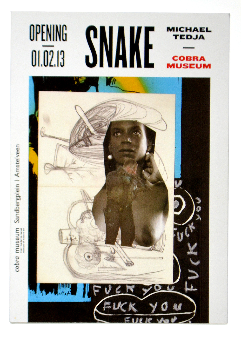
— > Flyers for Michael Tedja in the Cobra Museum.
Michael Tedja’s artworks all look very different and needed a typographic framework to make the publicity of his exhibition in the Cobra Museum look consistent
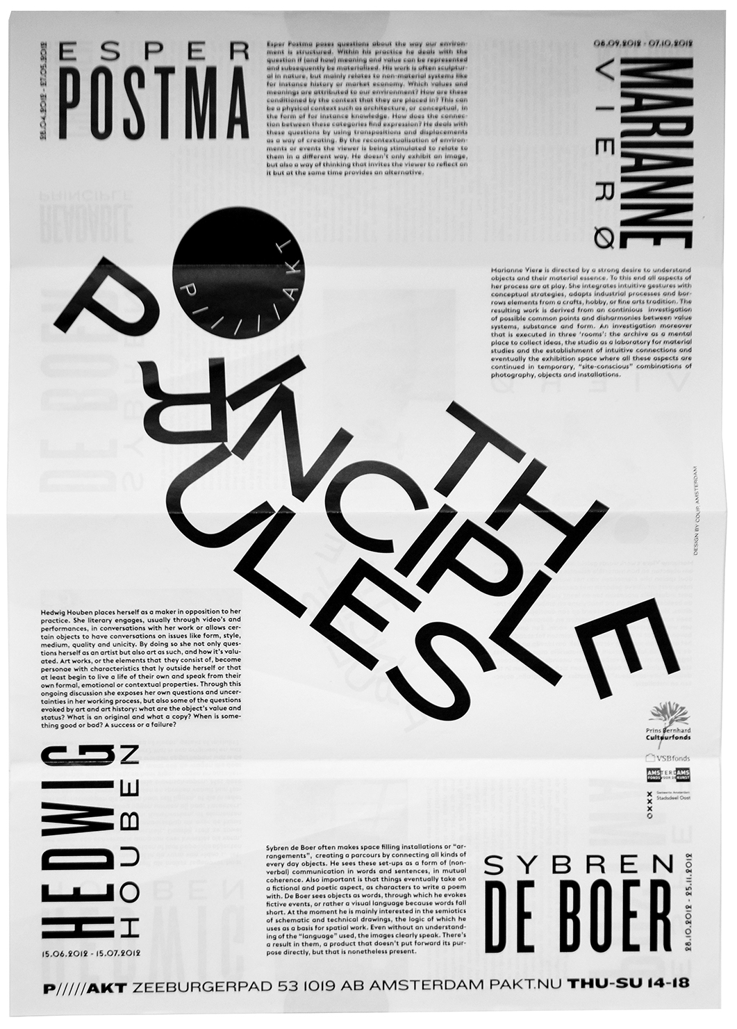
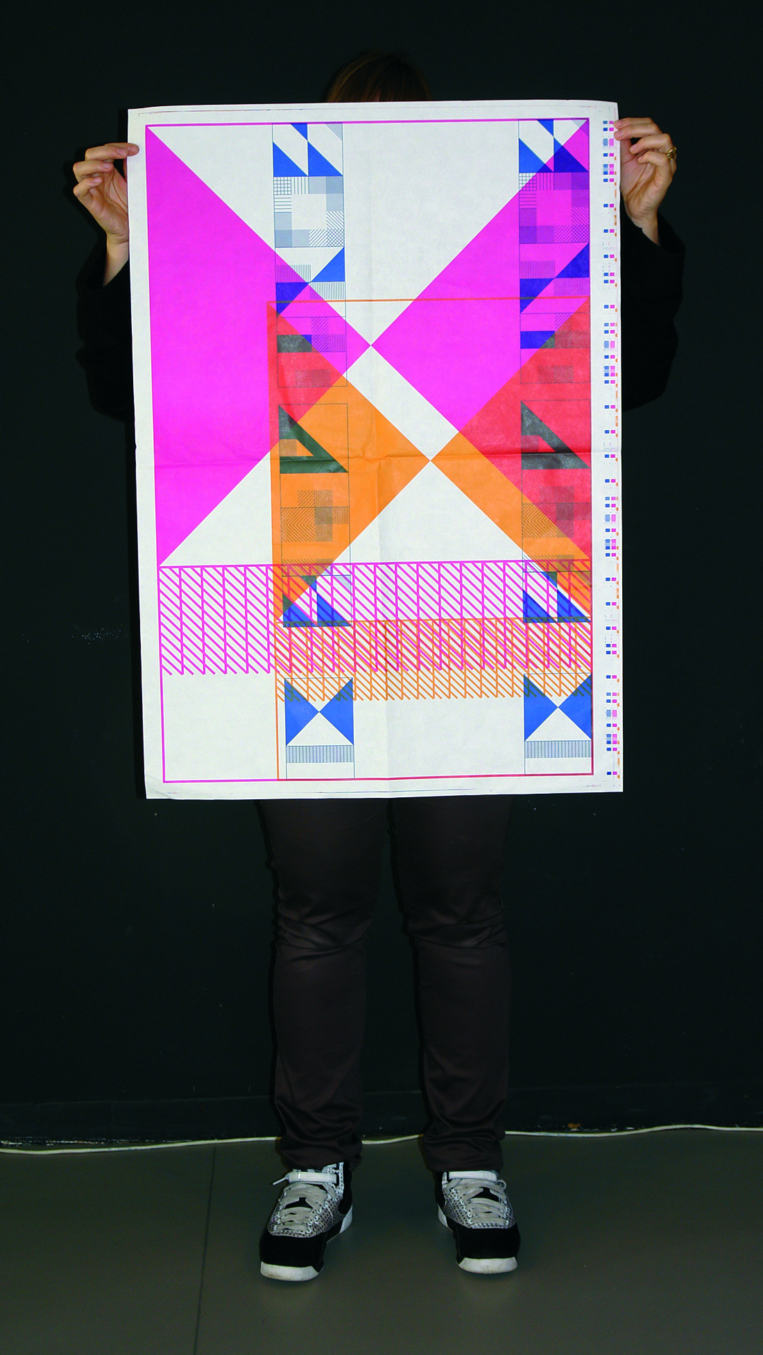
— > Flyer for Pakt: The Principle Rules.
The Principle Rules was an event about constructing and readability. The typography in the flyer and the brochure focused on readability as the result of a collapsing construction.
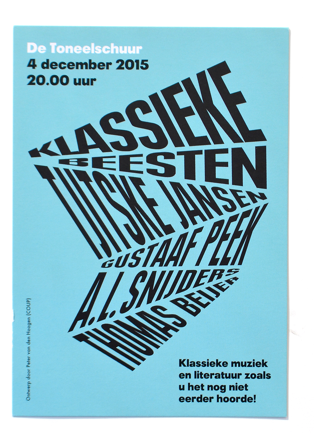
— > Poetry Out Loud posters and flyers for De Toneelschuur.
The posters and flyers are made for Klassieke Beesten, an event that could be described as a dynamic sum of poetry and music
— > Flyer for PAKT: All We Can Do Is What We Actually Doing Already.
The design of this flyer is put on top of the previous flyer design for P/////AKT (on the left corner you can still see it) in order to emphasize the ongoing flow of shows at P/////AKT.
