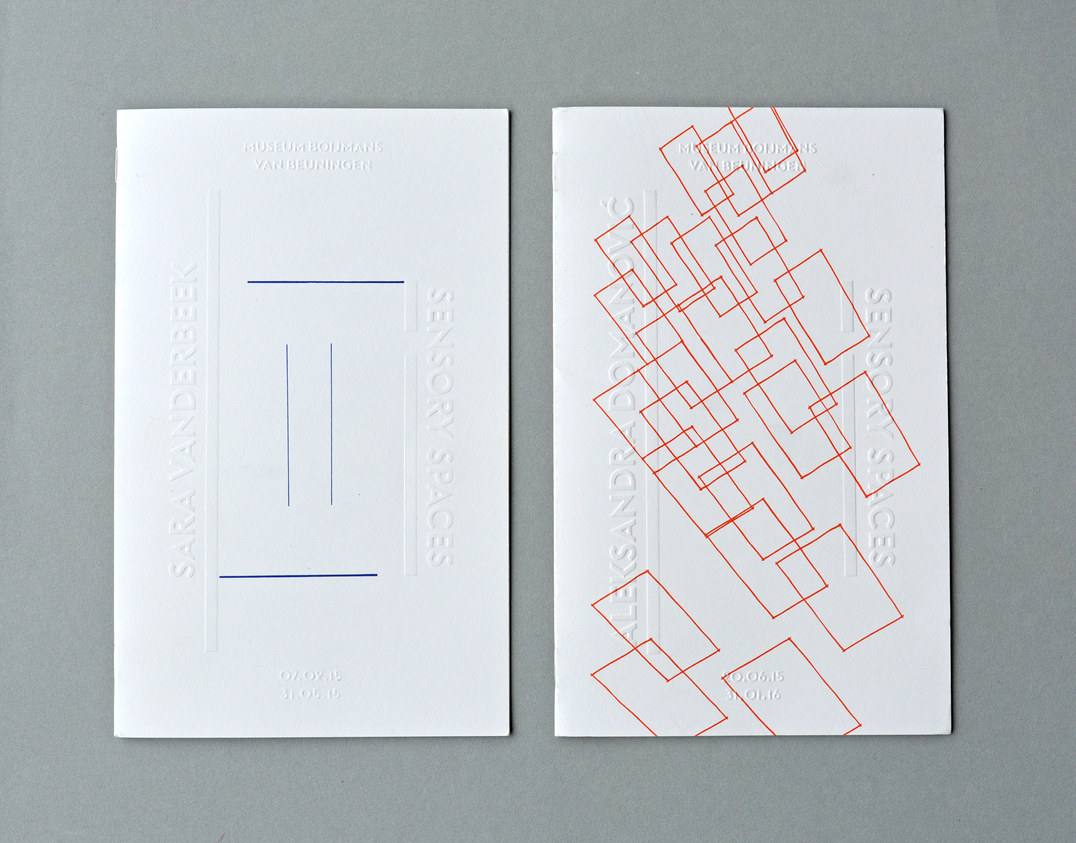
Design concept: The floor plan of the exhibition space functions literally as a framework for the layout. For every brochure, the participating artist is asked to sketch his or hers upcoming artwork into this framework on the cover which is printed on different weights during the series
AuthorPeter van den Hoogen
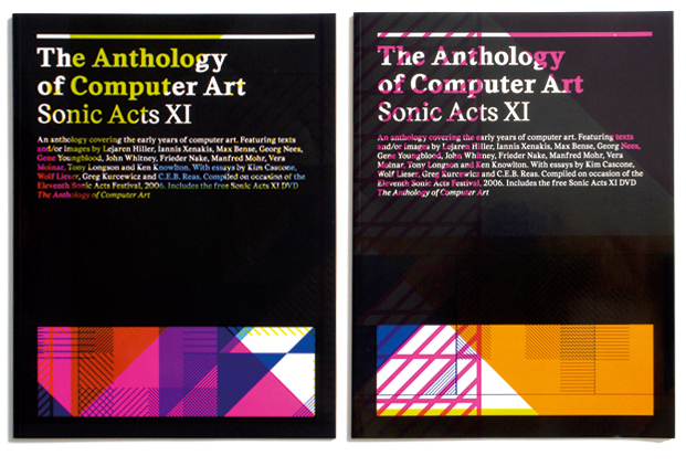
— >Publicity in different printing stages for Sonic Acts (2006) in Paradiso
Starting point was a process that would generate the design. With every printed item an extra layer was added to the printing sheet containing a zoom-out of the same design in a new pantone colour. All items have been cut in several ways from that same printing sheet, which results in different crops of the
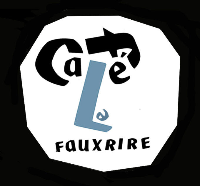
— > Typographic portraits for Café Le Faux Rire
Café Le Faux Rire is an artist evening in the café of the Cobra Museum. Le Faux Rire means fake laugh.
— > KNMI Poststamps for TPG Post.
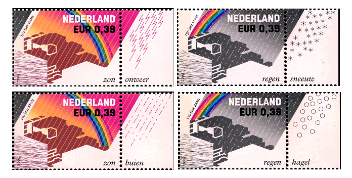
2 Poststamps designed for the dutch Postal Service TPG Post, published on the occasion of the 150-year anniversary of the Royal Dutch Meteorological Institute (KNMI). The sender is offered to create a personal weather report by adding the seals from the margin to the stamps.
— > LimoZine 24 & 25 (2018)
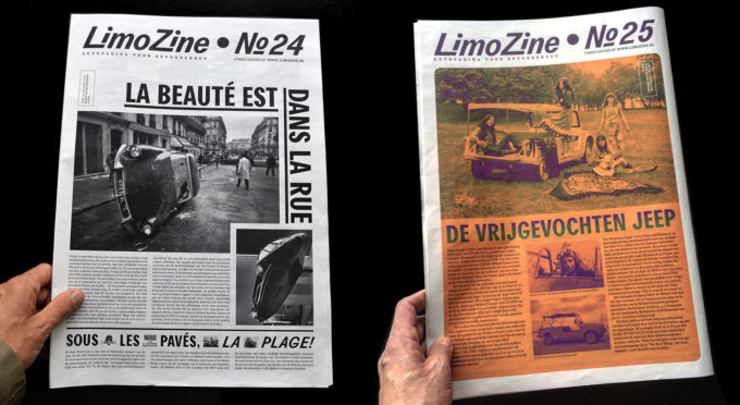
The 24th edition of Limozine (written and designed by COUP) is one A3 page published in a magazine of a friend. (order here)
— > Book design on Simon Starling for the Rijksmuseum Amsterdam.
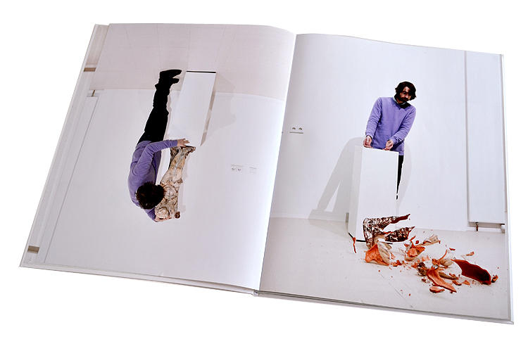
This book is the documentation of a project by English artist Simon Starling in the Ateliergebouw of the Rijksmuseum in Amsterdam.
— > Book design for Stedelijk Museum Amsterdam: 3 books in 1 cover (awarded best book designs).
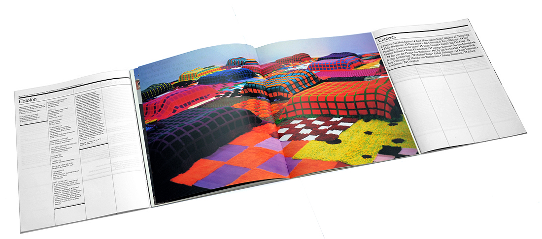
This book has never been online before. It is the accompanying catalogue to the exhibition Life in a Glass House, a proposal for Municipal Art Acquisitions 2001/ 2002 in the Stedelijk Museum Amsterdam
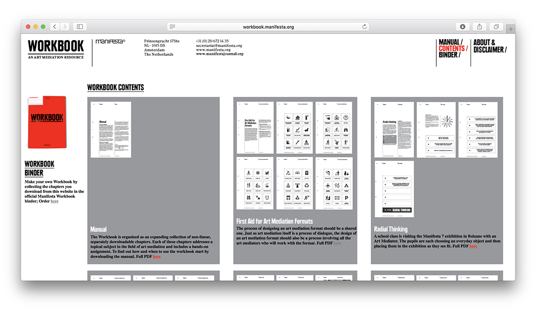
— > 2010 Workbook website for Manifesta Foundation
This is the place where you can find Manifesta Art Mediation content divided in chapters.
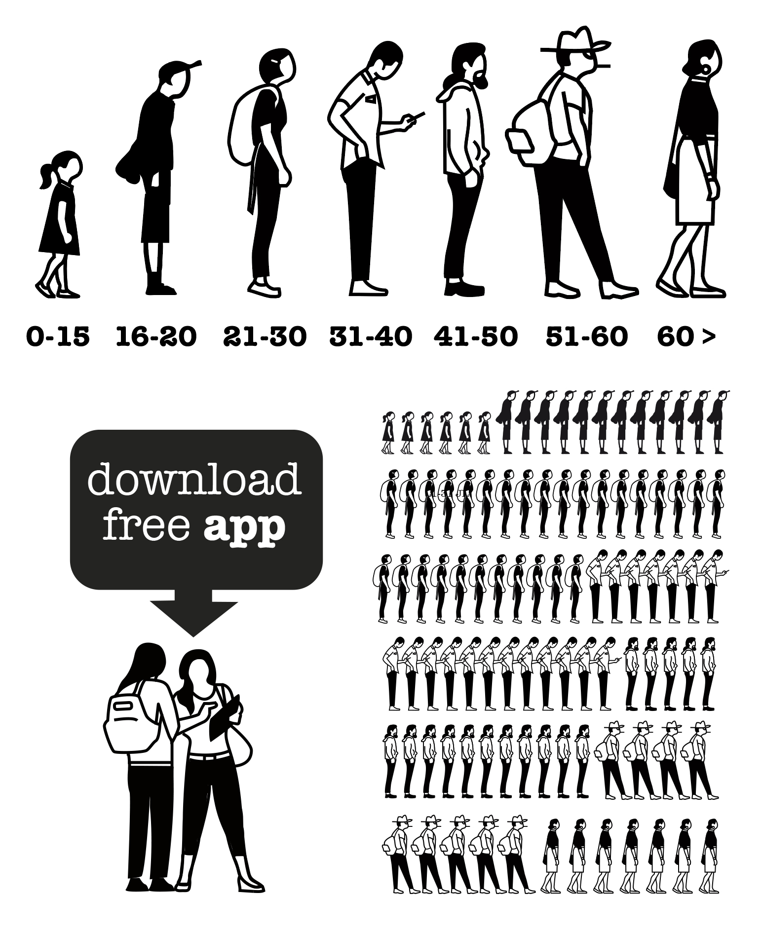
— > Gerd Arntz inspired statistics (2014) for the Anne Frank House.
When the Anne Frank House asked COUP to make illustrated statistics about visitors and activities, COUP noticed that the logo of the Anne Frank House exactly looks like a pictogram of Gerd Arntz, famous for creating the statistics for Otto Neurath’s book “Modern man in the making” from the 1940’s.
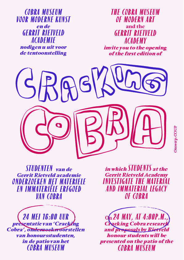
— > Flyers / brochures for Rietveld Academy workshops in the Cobra Museum.
If you dive into the archives of the Cobra Museum — like the Rietveld students did during their workshop — you can discover the inspiration for the Cracking Cobra logo.
