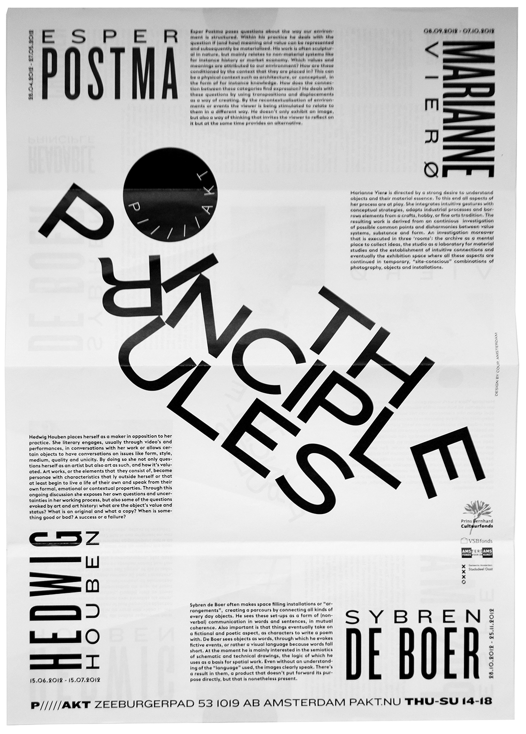
The Principle Rules was an event about constructing and readability. The typography in the flyer and the brochure focused on readability as the result of a collapsing construction.
AuthorPeter van den Hoogen
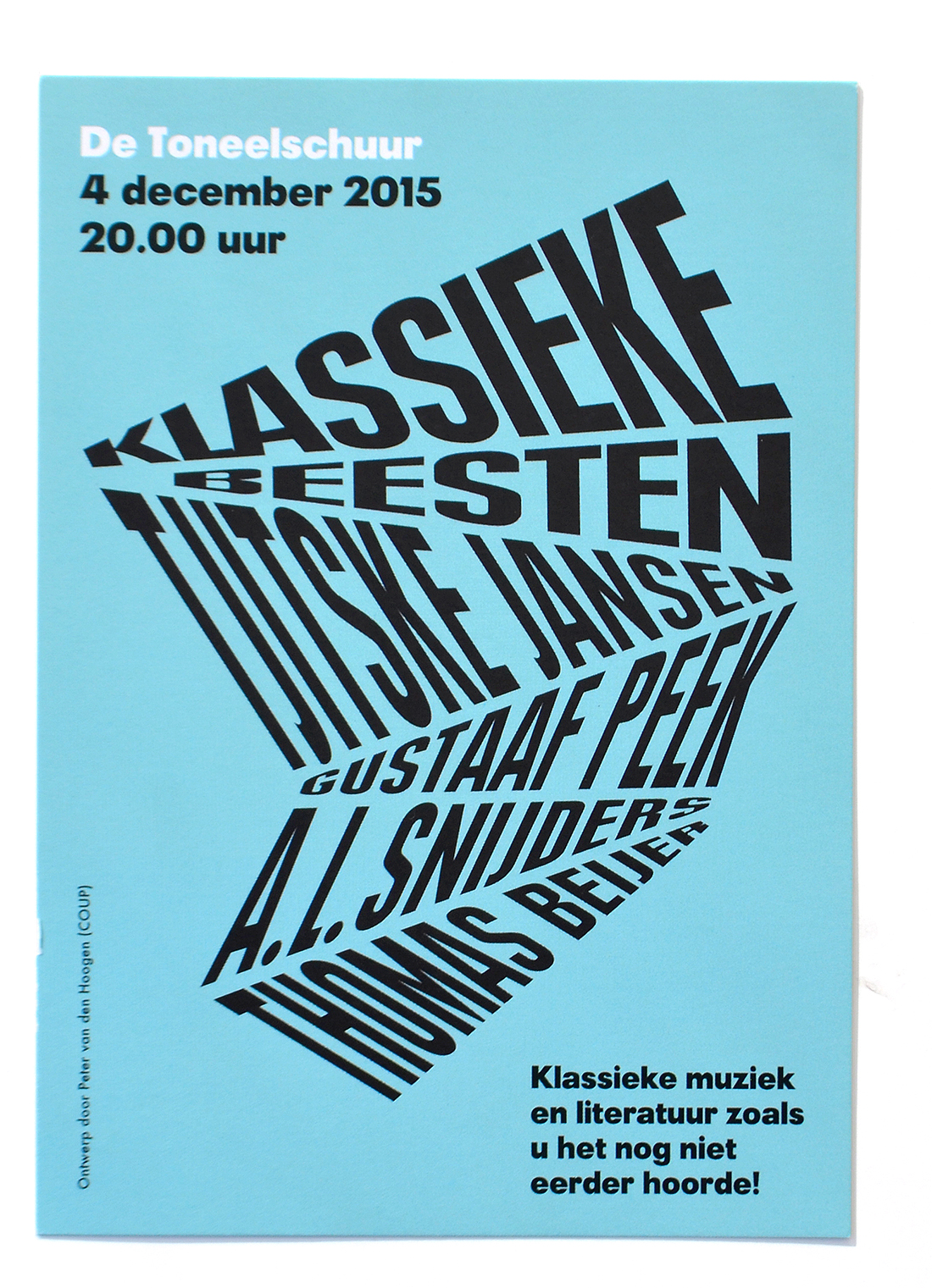
— > Poetry Out Loud posters and flyers for De Toneelschuur.
The posters and flyers are made for Klassieke Beesten, an event that could be described as a dynamic sum of poetry and music
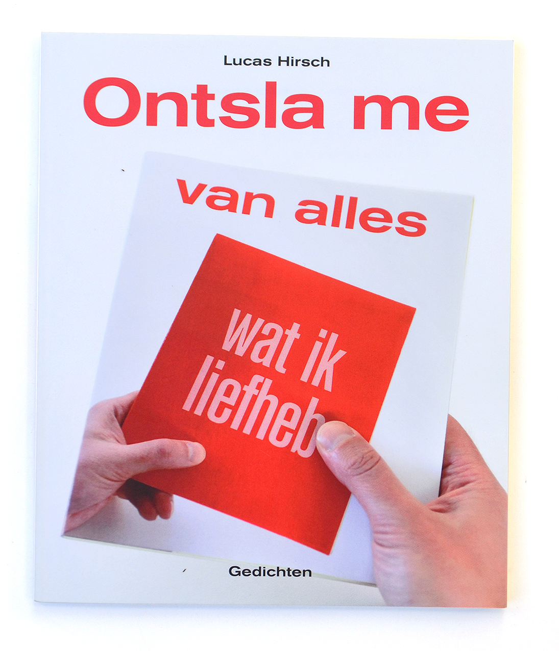
— > Poetry book cover design for de Arbeiderspers.
The title on the cover reads back in time via the covers of previous books, and emphasizes the content as the latest development of an ongoing story
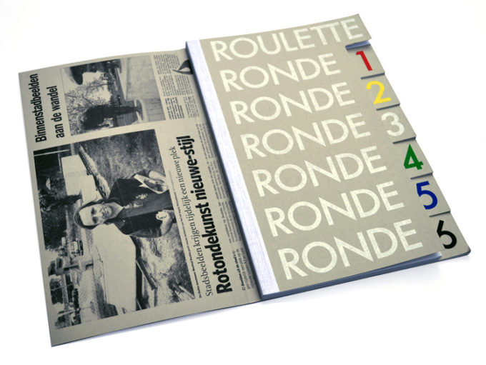
— > Book design Manfred Pernice with 8 covers, for SKOR / Utrecht Cultural Affairs.
This is the accompanying catalogue of Roulette, an art project in 6 rounds by German artist Manfred Pernice, taking place on a roundabout just outside the city of Utrecht. Every round in the book is more than just a chapter. It has its own cover.
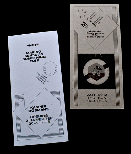
— > Flyer for PAKT: All We Can Do Is What We Actually Doing Already.
The design of this flyer is put on top of the previous flyer design for P/////AKT (on the left corner you can still see it) in order to emphasize the ongoing flow of shows at P/////AKT.
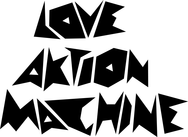
— > Bela Lugosi’s Dead (typeface).
This typeface was born from doodles during a long phonecall with the artist Lars Eijssen. Conversations with Eijssen often inspired Peter to start making designs in the meantime.
— > MiniCoup: T-shirt brand for children.
More text and photos will be added later.
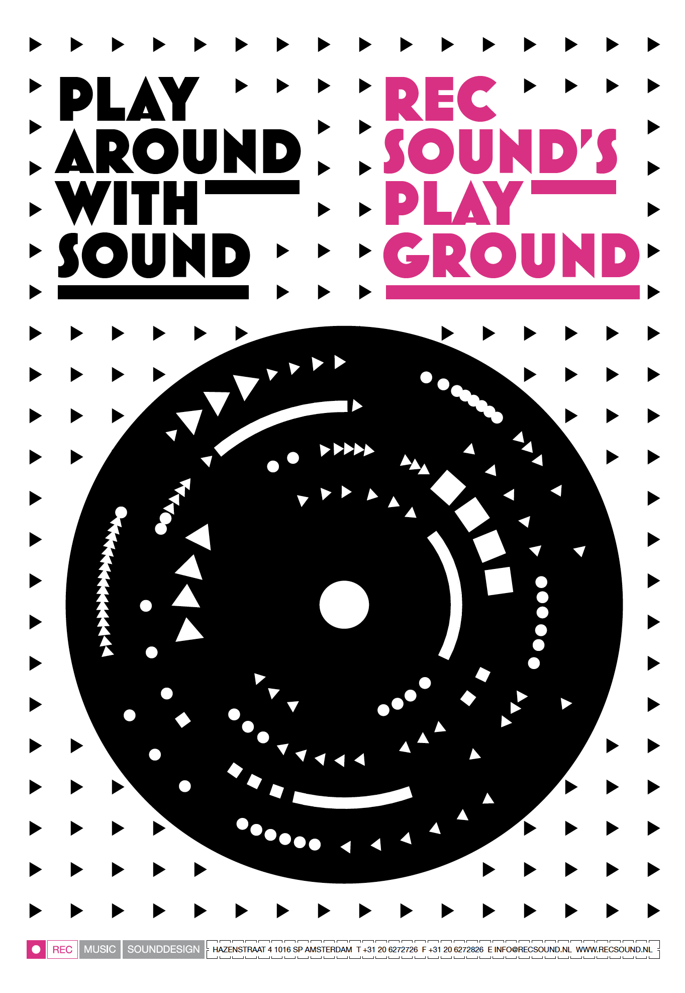
— > Poster for REC Sound in the language of Recording.
It visualizes the ongoing creative process of playing and recording during the composing of a new soundpiece, the work REC does daily. We only used audio icons to fit in the housestyle we designed earlier for them.
